 Andy Huntington
 Datadecs

Photo Russell Duncan.
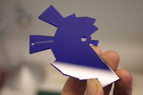
For Christmas 2009 the Really Interesting Group wanted to create a a gift comprising a series of 4 unique decorations based on each recipient’s use of the Flickr, Dopplr, Last.fm and Twitter. Having used a couple of the software APIs they were thinking about using (flickr and dopplr) and with experience of rapid prototyping we worked together to turn the data into something physical.
Here I’m showing some of the development work, but there’s a little bit more info on the RIG site, on twitter and on flickr.
Some of the resulting decorations are more easily read than others where the data visualisation is direct, and others are a little more abstract. The project depends on user data and the amount and detail of those data is down to the person. Some sign up to Last.fm but don’t scrobble, some hide their EXIF data on Flickr, some people aren’t fellow travellers on Dopplr. This variety is reflected in the decorations. For those who’s data was unusable or unavailable a special 404 error message was created.
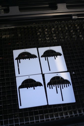
Three of the four Datadecs are laser cut and one is rapid formed. For the laser cutting I developed a series of Processing sketches to generate cutting paths and the snowmen were generated using RhinoScript.
Each snowman has a unique head size determined by the number of followers the recipient has on Twitter. These figures varied from around 5000 to 50 so they were mapped on a maximum and minimum head size. Ben was concerned that the snowmen should always look like snowmen with a smaller head than body. From some initial experiments like the ones below we chose to have a consistent body size and vary only the head.

Each piece was created using a VIPER SLA machine, resulting in a nice, strong and shiny white snowman. If you want to see more pictures from their production see this flickr set.
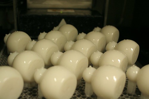
Scripting each snowman allowed for easy personalisation of each one with details like the name in the base. This video shows the script in action.
Flickr
These were a little more obscure. They show the distribution of aperture values used in the photographs since 1st Jan 2009. In most cases the value for F2.8 came highest (presumably due to cameraphone and auto-aperture usage). Once again, the values were mapped onto a logarithmic scale to cope with the large variations. The values are then sorted by fstop and wrapped around a circle in a manner similar to that used in cylinder.
Last.fm
These are the number of scrobbles submitted to Last.fm per month for 12 months starting in October 2008. The results can be read from top to bottom.

Dopplr
Each drip from the cloud on the dopplr decoration is the number of miles travelled in a particular month. The values used are calculated in the same way Dopplr use to generate their annual report data.
More details will come soon, as people open their boxes, otherwise, see DataDecs on the RIG site, on twitter and on flickr.
Special thanks to cutlasercut.
Post Script: in 2011 we repeated the snowman making under the guise of FRSTEE. Allowing folks to buy figures based on their Twitter usage in time for Christmas.